5 Rules for Building Effective Data Dashboards
Information is only as valuable as its accessibility. Learn how to transform noise into insight.

In an era where every click and transaction is recorded, businesses find themselves drowning in wide streams of data. However, data without clarity is overhead. To drive decision-making, we must distill complex datasets into intuitive visual stories.
Rule 1: Know Your Audience
Before plotting a single point, define who is reading. An executive needs high-level KPI trends at a glance, whereas an operations manager requires granular, actionable metrics. Tailoring the dashboard to specific persona needs ensures relevancy and utility.
Rule 2: Avoid Clutter; Embrace Whitespace
The human brain can only process a limited amount of information at once. Excessive lines, borders, and competing colors create cognitive load. By using whitespace effectively, you guide the eye to what truly matters—the outliers and the trends.
Rule 3: Choose the Right Chart Type
Not all data belongs in a pie chart. Use line charts for temporal trends, bar charts for comparisons, and scatter plots for relationships. Each chart must serve the specific data narrative you intend to convey.
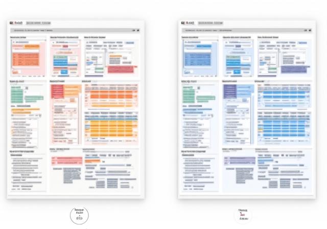
Rule 4: Consistency is King
Maintain consistent color schemes and labeling. If 'Revenue' is blue on one page, it should not be green on the next. Uniformity allows users to leverage their learning across different views of the platform.
Rule 5: Prioritize Interactive Drilling
Static reports are a thing of the past. Users should be able to hover for details or click to drill down into specific data segments. Interactive visualization allows the user to ask "why" and get an immediate answer.